Oh my gosh, there hasn’t been a bigger change since cellphones replaced pagers. Features are exploding everywhere on the new reconciliation screen. There are so many to be excited about. At first glance, I felt betrayed, like my office dog had run away. But once I dove in, I loved it.
It’s like going to an all-you-can-eat buffet in Vegas. Everything is so shiny and new, and it’s overwhelming as to where to start. But once you do, it’s mouthwateringly fantastic.
What’s New
First, you must opt-in to see these changes by turning on the new reconciliation in QuickBooks Labs. It seems so appropriate that this area is called the “playground.” It truly is a place to play and try out new options with little or no risk, since you can turn them off if you desire.
New Reconciliation Layout
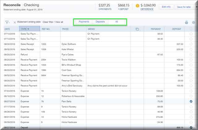
First, the layout of the reconciliation screen has improved. Gone are the days of a split screen for deposits and expenses. Now, all transactions are default sorted by date with the option to switch to type, ref no., payee, memo, payment/deposit value. Take a peek at the new layout.
Sorting and filtering transactions appears to be a driving force behind all the enhancements. It’s like QBO techs got in a room and said, “How many ways do our users sort and filter?” and they gave it all to us.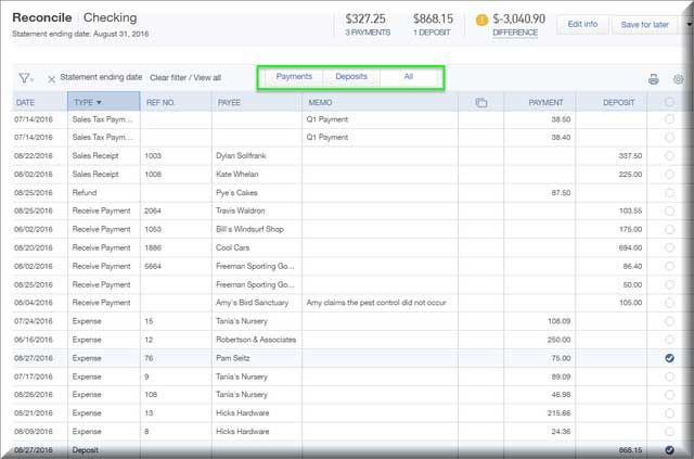
This new layout means you can use the entire landscape to view Payments, Deposits, or both.
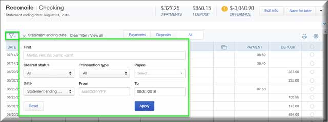
If you want to work with just your Deposits, select “Deposits.” and the table will display your deposits across the entire landscape to make reconciliation more friendly. You can filter for your just cleared deposits that match the bank statement brought in by bank feeds. You can also filter by date, type, payee, dollar amount or memo – whatever works for you, as seen in the choices below.
The new reconcile feature also gives you the ability to edit and customize the display (shown below).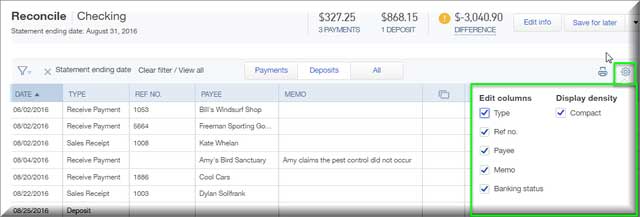
Reconciliation Reports
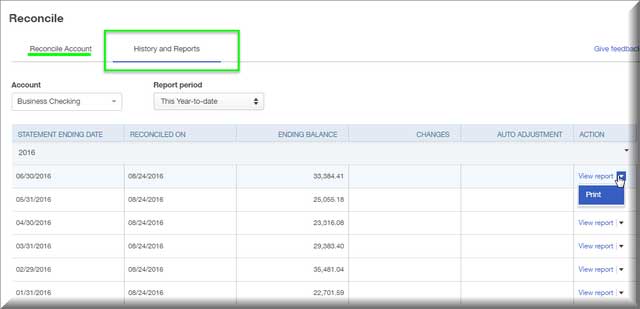
Previously, only the accountant could view and print prior reconciliation reports. Now all users can view access these reports. To view or print a previous reconciliation report:
From the Company Gear icon, select Reconcile
Choose History and Reports
Select a Bank account
Choose a Statement date
Select your desired option, View or Print
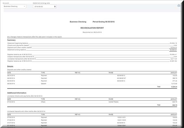
The Reconciliation Report (as seen below) is interactive, which allows you to choose a row or transaction and view the details of the transaction.
Beginning Balance Discrepancy Report
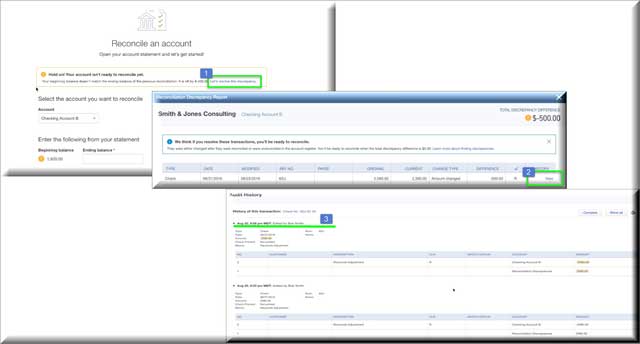
Another new feature is an alert telling us the beginning balance does not match the ending balance of the previous month. To view the Discrepancy Report, select:
1. The Resolve the discrepancy option generates the Reconciliation Discrepancy Report
2. From the Reconciliation Discrepancy Report select the option to View the transaction
3. QuickBooks will display the Audit History.
Conclusion
I am a big fan of QBO. I admire the Intuit team for making ongoing improvements to a product I use and recommend every day. This Reconcile upgrade is a Win for sure.
Don’t worry if you’re tempted by all the new features and enhancements that are going on in QuickBooks Online, they’re there for your enjoyment. So, go ahead and try them.


